Twelve looks
The first impression of Twelve is somewhat more 'bloated' compared to the lean default UI in Opera. But it should be very easy to find all the functions you can use during browsing, and it doesn't get worse then this: there is no need for panels, for example. Who wants three ways to access bookmarks?
Here are some screenshots. Note that I can't make it as pretty as the MS Office Ribbon, Opera's toolbars are more limited and I didn't create a special skin with extra buttons.
Normal state
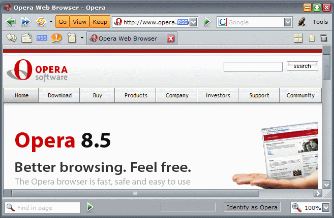
The windows starts with a toolbar for the most important functionality of a browser: back, forward and address field, and a search field. And furthermore access to all other functionality with buttons for the three hidden toolbars, a microphone for Voice control, and a Tools menu. Then you get a Tab bar. With the icons on the left of the web page tabs you get access to the main functions: panels, mail, RSS, chat, new webpages. Choose right-click, 'Remove from toolbar' if you don't use these functions. To the right of the web page tabs you find the 'Tile' and 'Maximize all' buttons, and the normal tab trash bin. I've added this Tile button after reading Lawmune's article on Quick tabs in MSIE. The status bar gives access to the inline find and zoom widgets.
After clicking the 'Go' button
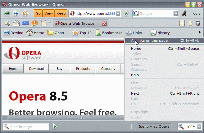
The Go bar gives access to all the places you can visit or have visited, starting with the Rewind button.
After clicking the 'View' button
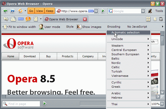
The View bar contains all the commands to improve or customize the display of websites. This includes a button for 'Block content, a new feature in Opera 9.
After clicking the 'Keep' button
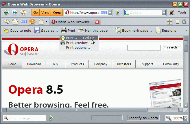
The Keep bar makes it possible to store information permanently: create a bookmark or note, the transfer dialog, all the printing options, etc.
After clicking the 'Mail' icon
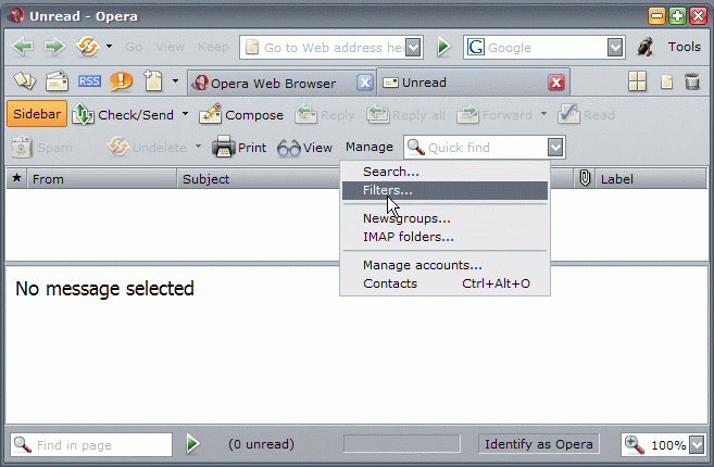
All mail functions, including managing accounts and filters etc, can be found here. Using the Mail panel for easier navigation between the various mail views makes sense. So a button to open the 'sidebar' is included.
After clicking the 'Feeds' icon
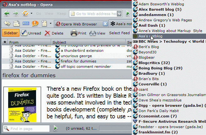
After clicking the 'Chat' icon
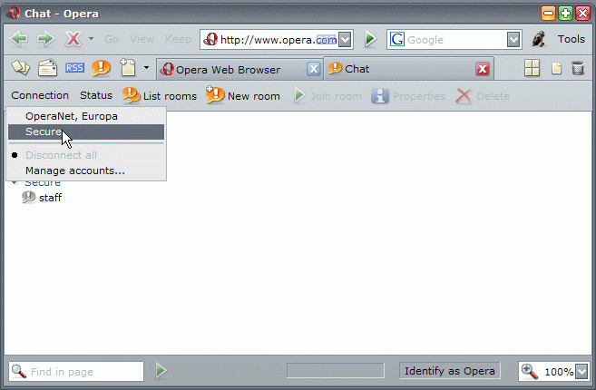
Here you get the 'Chat manage' page with enhanced functionality, so the Chat panel is needed at all.
After clicking the 'Tools' menu
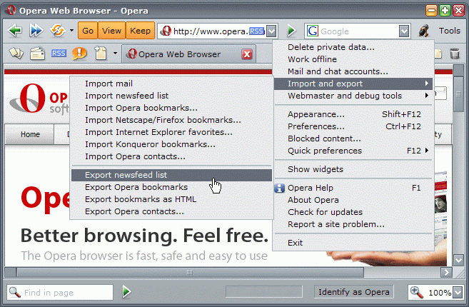
The hallmark of bad interface design: a bucket of 'other' actions. You shouldn't need it much though.
